CRM · Sales Force · Sisloc
Redesigning a Complex B2B Sales Workflow
Redesigning a critical sales flow without oversimplifying business complexity
- Product Design
- B2B SaaS
- Enterprise
- Web + Mobile
Overview
Sales Force is Sisloc’s CRM for equipment rental and sales companies. Creating proposals is one of the product’s most critical workflows.
The challenge
Migrate a workflow built in Delphi to web and mobile without losing years of accumulated business rules.
- Role
- Product Designer
- Company
- Sisloc
- Platform
- Web + Mobile
- Scope
- CRM · Proposal workflow
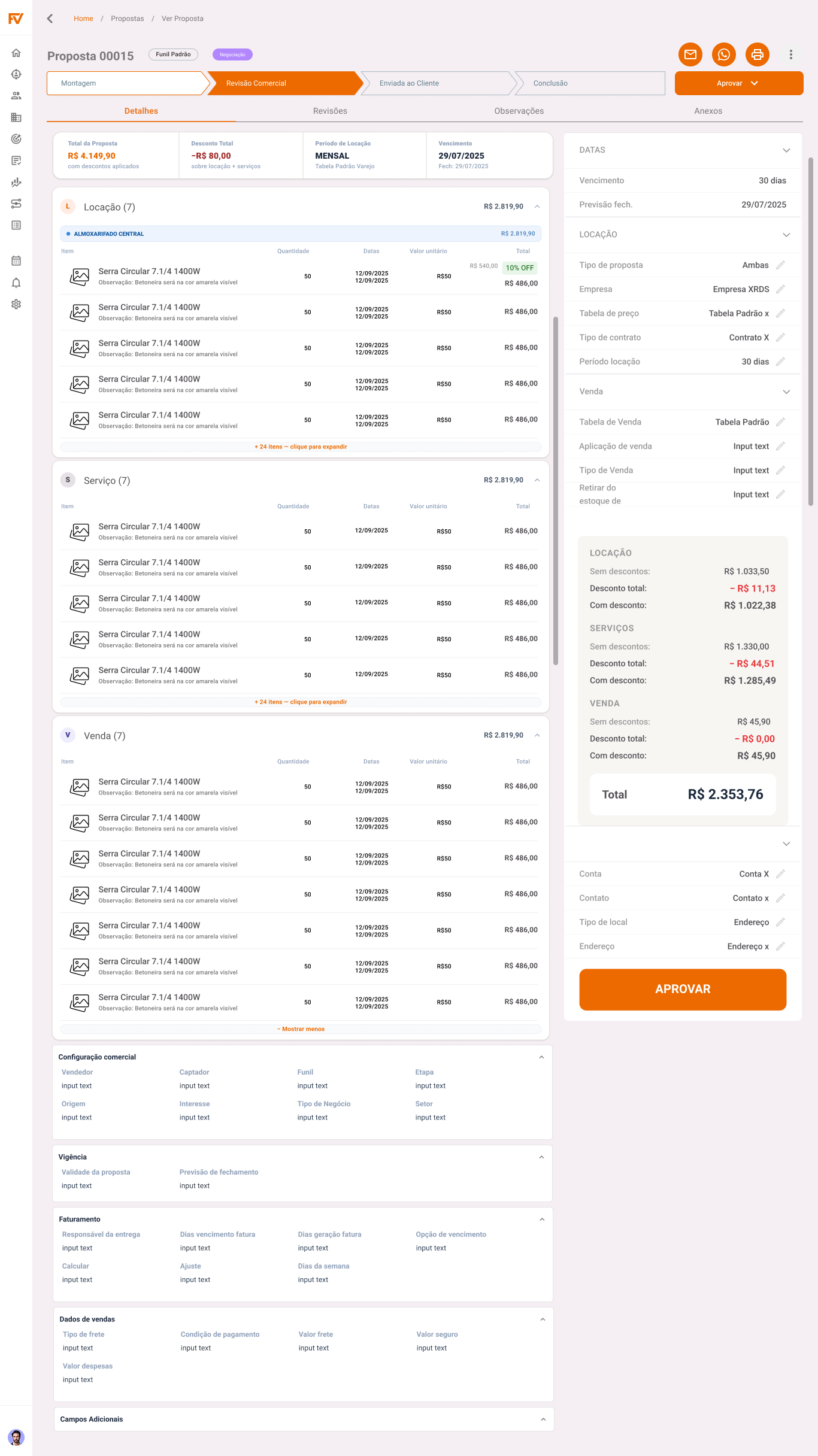
A sales flow surrounded by rules
Creating proposals was a critical flow in Sisloc’s B2B CRM. To reach the catalog and build a cart, salespeople had to manage commercial context, company, account, pricing table, period, and operation-specific conditions.
Rental and sales products also involved composition rules, tax calculations, quantities, and commercial values. The redesign needed to improve the operation while preserving the dependencies supporting the business.
The same flow also needed to work on a phone during client visits.
My role
I worked on the end-to-end flow redesign, from experience architecture to behavior specification and desktop and mobile prototyping.
I analyzed the legacy system, structured the new flow, discussed business rules with Product and Engineering, and translated UX decisions into specifications clear enough to guide implementation.
The same business stage required different behavior
- Desktopsticky side panelMobilefixed progress strip
- Desktopproposal tableMobilecards
- Desktopinline editingMobilebottom sheet
- Desktopmouse drag and dropMobilelong press
On desktop, a sticky panel, tables, inline editing, and mouse interactions used the available space. On mobile, a progress strip, cards, bottom sheets, and touch-appropriate gestures preserved the proposal’s progression in a different context.
Collapsible context made room for the task
One of the first mobile questions concerned how much context was necessary to build a proposal.
The initial solution kept this information permanently visible as chips. On a small screen, it competed with the main task: finding and adding products.
Before
Secondary information competed with the main task: finding and adding products.
After
The context remains available without continuously occupying the screen.
- Scroll
- ↓ collapses↑ reappears collapsed
- Tap
- tap → expands for editing
I turned the context into a collapsible area. Information remained accessible without permanently occupying space dedicated to the primary task.
The component also gained independent scroll and direct-interaction behavior, documented separately to prevent conflicts between states.
Complexity does not need to disappear. It needs to appear at the right time.
Product search became permanently visible
Another debate focused on catalog search. In other modules, search lived behind an icon. In the catalog, finding products was a central, recurring task, so the field remained visible.
Other modules
search behind an icon
Catalog
search permanently visible
In the catalog, search is a primary task, not a secondary function.
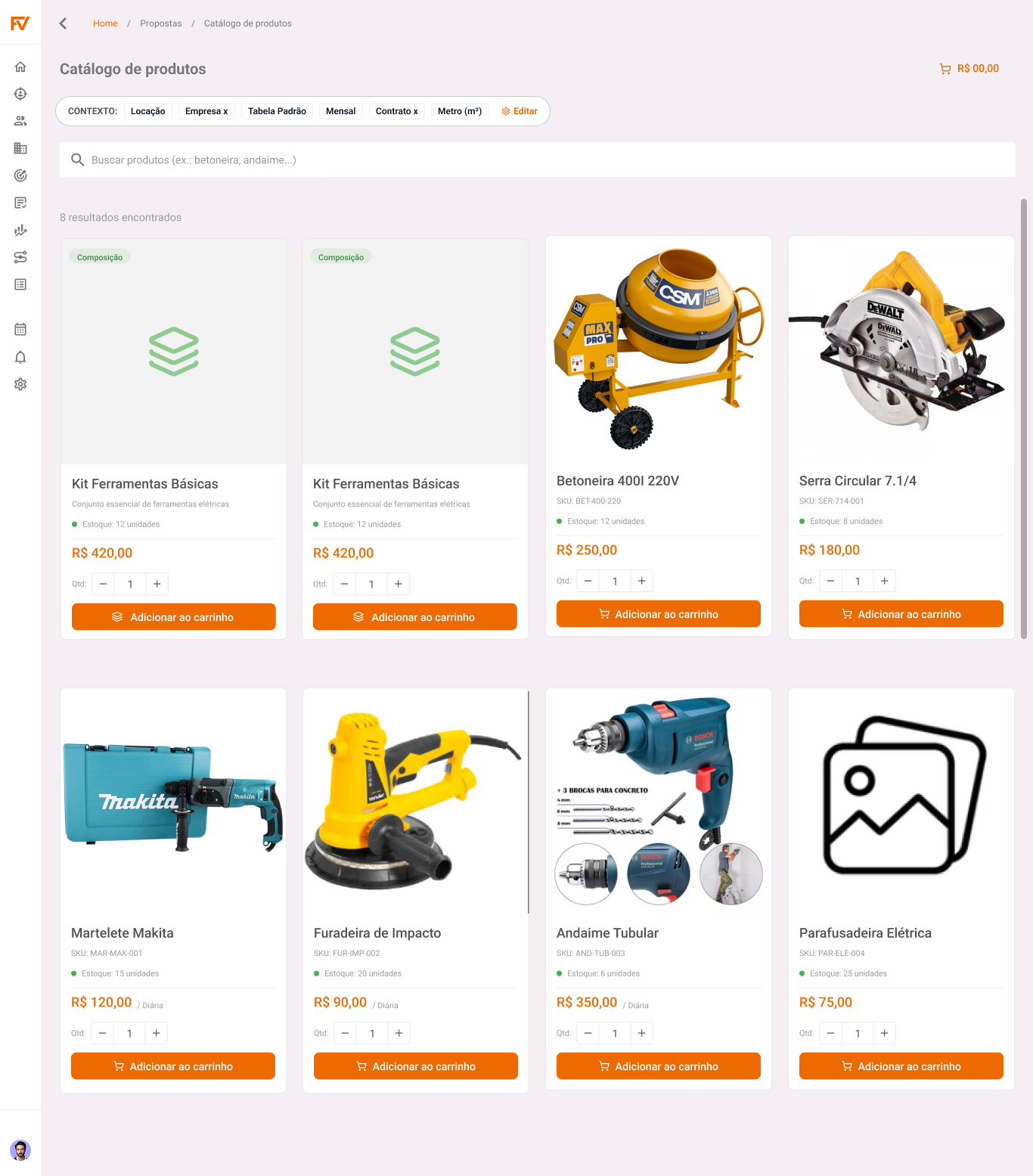
A vertical list supported reading and comparison
Alternative
Two-column grid
- long equipment names were truncated
- prices lost hierarchy
- quantity controls became cramped
Decision
Vertical list
- image on the left
- information on the right
- separators
- greater legibility
Closing search restored cart visibility
In the existing flow, search remained open after an addition and covered part of the cart. Users lost visibility of selected items, duplicated products, or forgot what they had already included.
- search→
- select product→
- add→
- search closes→
- cart regains focus→
- action confirmed
Keep search openfaster sequential additions
Close searchmore visibility and control
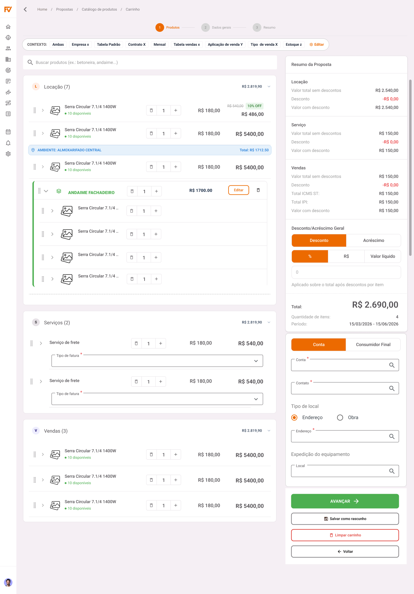
I began closing search after every addition, restoring the cart view and confirming the action. The decision reduced the speed of consecutive additions but increased control over the proposal’s current state.
Calculated quantity, editable commercial value
One of the most complex parts of the flow was product composition. Some items use formulas to calculate quantities automatically. The initial specification stated that both quantity and value should be locked whenever a formula existed.
During alignment with technical leadership, we identified that the actual rule was different.
Initial interpretation
Actual rule
The formula controls quantity, while the salesperson can change the value for commercial reasons: calculated and locked quantity; editable commercial value.
This alignment happened before implementation and prevented an incorrect business-rule interpretation from entering the new interface.
From Figma to behavior specification
Some components combined states, calculations, and interactions that a static Figma composition could not explain adequately.
I used interactive prototypes and small code experiments to specify reactive calculation, content expansion, composition organization, and cross-platform adaptation.
I also worked with Engineering on decisions such as the cart’s action footer. On smaller monitors, primary buttons disappeared below the viewport as content grew.
Before
After
The footer became fixed so wizard actions remained predictable and accessible regardless of content height.
What to preserve, simplify, and adapt
- Delphi→Web + Mobile
- Implicit knowledge→Explicit rules
- Static specification→Documented behavior
- Ambiguity→Alignment before development
Designing for a complex B2B system required distinguishing what could be simplified, what needed to remain visible, what was a business rule, and what should change with device and context.