Case study
Bringing a Complex B2B Product to Mobile
Beneficiary Experience · Pris
Redesigning a complex experience for people who only needed the essentials
- Product Design
- Mobile UX
- B2B2C
- Financial Experience
- Information Architecture
Desktop
Administratormanages- programs
- grants
- rules
- processes
Mobile
Beneficiarytracks and decides- reviews
- understands
- tracks
- decides

A different user, with different priorities
The desktop product had grown around administration. On mobile, the beneficiary became the primary user, redefining the entry point, hierarchy, and priority tasks.
My role
I defined the mobile experience, reorganized information architecture and hierarchy, and designed access, portfolio, event, and program flows.
What does someone actually need to know and do when accessing their plans on a phone?
The journey began to follow the beneficiary
The sequence started with the current position, moved to upcoming events, and reached programs when there was something to decide.
- Sign in↓
- Understand the current position↓
- Track upcoming events↓
- Access programs↓
- Act when needed
Desktop
What does the system allow people to do?
Mobile
What does this person need to know now?
The portfolio became the starting point
What do I have today?
A summarized view of the assets answered the beneficiary’s most immediate need: understanding their current position.
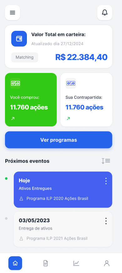
Upcoming events anticipated what deserved attention
After understanding the current position, the beneficiary needed to know “what happens next?”. Upcoming events became prominent so people could anticipate what deserved attention.
- Current position↓
- Next event↓
- Attention / follow-up
Programs connected information and action
- Portfolio↓
- Upcoming events↓
- Something requires attention↓
- Program↓
- Accept / decline / act
A CTA led to this area from relevant points in the experience and sustained the journey: notice → understand → access → act.
The architecture separated the two contexts
Administrative context
Program setup, grants, rules, and complex processes.
Beneficiary on mobile
Information worth reviewing, tracking, and acting on.
Designing for mobile is not deciding what fits on the screen. It is deciding what deserves to be there.
Portfolio, events, and programs in a single journey
- Administration-oriented experience→Beneficiary-oriented experience
- Large volume of functionality→Prioritized relevant tasks
- Navigation by area→Portfolio as the entry point
- Static review→Event tracking
- Information→Information + action when needed
The portfolio became the entry point for tracking events and moving into programs whenever action was required.
