Case study
Design System as Product Infrastructure
Sisloc · Tokens, Components & Implementation
Turning a visual library into an implementable interface foundation through tokens, component APIs, and code-based documentation.
- Design Systems
- Design Engineering
- Vue 3
- Vuetify 3
- Storybook
- Design Tokens

From Figma to an implementable foundation
Sisloc already had visual patterns defined in Figma, but turning those patterns into reusable components required more than reproducing interfaces.
The work came to include decisions about:
- how to structure tokens;
- how to separate visual state from behavior;
- how to design component APIs;
- when to reuse Vuetify capabilities and when to create our own abstractions;
- how to keep Figma and implementation close without relying on fragile overrides;
- how to document components so they could be reused later.
The stack included Vue 3, Vuetify 3, Vite, and Storybook.
Tokens organized into three layers
The system began with two token layers:
primitive → semantic
During implementation, it became clear that some values belonged specifically to components. The structure evolved into:
primitive → semantic → component
Before
Component-specific decisions reached the shared semantic layer.
After
Button, Input, Select, Modal, Snackbar, Chip, and Tabs could now own their specific decisions.
The architecture came to include primitive colors, semantic tokens for text, feedback, borders, typography, and elevation, as well as component-specific tokens for Button, Input, Select, Modal, Snackbar, Chip, and Tabs.
Anticipating conflicts before they happened
Another problem appeared before many overlays even existed: how could dropdowns, sticky elements, modals, tooltips, and notifications avoid a z-index war?
Instead of defining isolated values in each component, I created a semantic scale:
- 01base
- 02raised
- 03dropdown
- 04sticky
- 05overlay
- 06modal
- 07toast
- 08tooltip
This turned a normally local CSS decision into a system architecture rule.
The Stepper revealed a modeling problem
The Stepper exposed this mindset shift most clearly. Early implementations tried to solve its geometry by alternating between SVG, clip-path, shadows, pseudo-elements, and negative margins.
But there was a deeper problem. The model mixed two independent concepts: step state, with active, completed, and upcoming, and step position, with start, middle, and end.
This led to states such as completedEnd and upcomingEnd. The names appeared to represent state but were actually combinations of state and position.
Redesigning the model
Instead of adding more exceptions, I reorganized the component into independent dimensions.
Previous model
passadoFinalproximoFinalNew model
shape = endcurrentupcoming
State controls appearance. Shape controls geometry.
completedEnd.A completed final step no longer needs a specific state such as completedEnd. It is simply state = completed and shape = end.
State began to control appearance, while position controlled geometry.
A clearer model simplified implementation
The geometry was also rebuilt. Instead of simulating the shape with clipping and shadows, I used an explicit SVG path.
Before
margin-left: -14pxoverlap / fragile composition
After
CSS Grid · path SVG · gapexplicit geometry / predictable composition
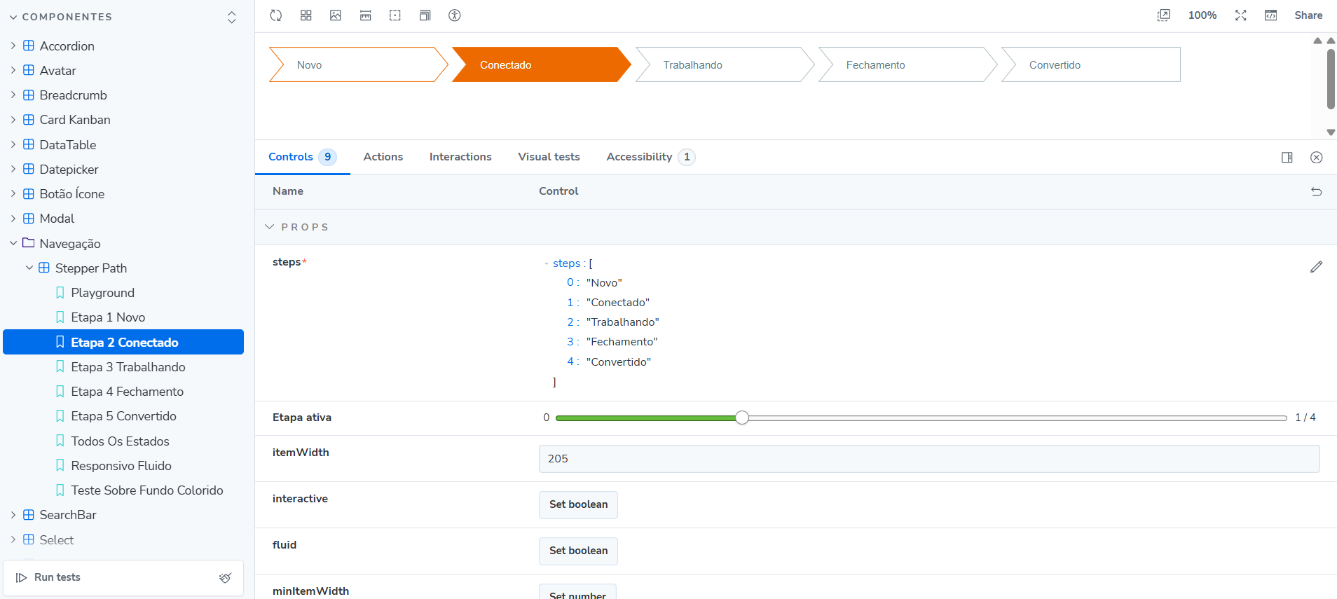
The change came from rereading the design itself: visually, the steps did not overlap. There was space between them.
The final component exposed a simple API:
<SislocPath
v-model="active"
:steps="steps"
:interactive="true"
/>
The most important lesson was not to keep correcting the wrong structure with more CSS. Component architecture came first, followed by geometry, states, and presentation.
Interfaces that are difficult to implement do not always need more CSS. Sometimes they need a better model.
DataTable organized through composition
DataTable was another important architecture exercise. Instead of turning everything into a single component, the solution used composition:
- props
- emits
- slots
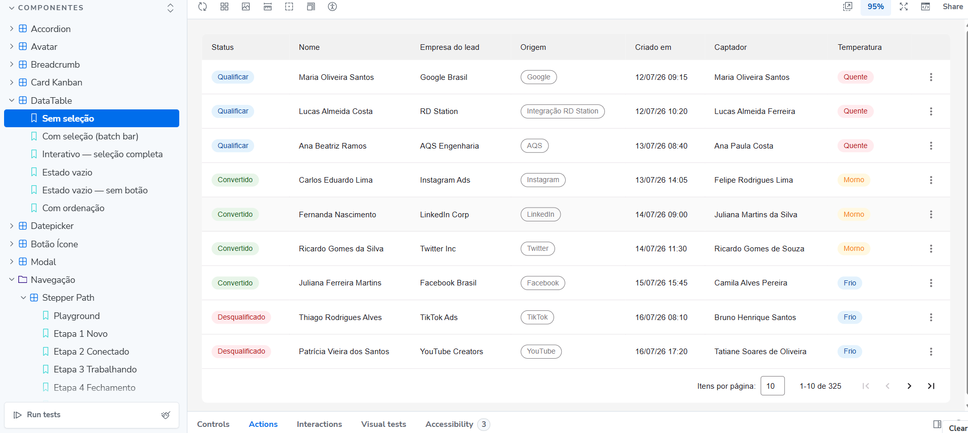
The table API uses props, emits, and slots to support customization without creating new variants for every need.
The implementation also included three-state sorting and partial selection using the checkbox’s native indeterminate state.
In Kanban, frames did not define the architecture
Kanban Card presented the opposite problem. In Figma, elements such as Card, Tags, Footer Bar, and Assigned Users appeared as separate frames.
It would have been easy to turn each frame into a component. But visual separation does not necessarily mean reuse.
Figma
I analyzed the structure and treated those parts as regions of a single component because they belonged to the same Card model.
To reduce approximations during implementation, I used the Figma API to inspect frame dimensions and element positions programmatically.
Card behavior also began to derive from state instead of independent visual variants:
const taskState = computed(() => {
if (!props.task) return 'empty'

return props.taskOverdue
  ? 'overdue'
  : 'scheduled'
})
This represented scheduled, overdue, or missing tasks without duplicating the component.
Accordion consolidated an API contract
Accordion helped consolidate a contract across API, state, behavior, and presentation.
Props
title · subtitle · defaultOpen · modelValueEmits
update:modelValue · toggle- API
- STATE
- BEHAVIOR
- PRESENTATION
controlled · internal state · aria-expanded · focusThe component supports controlled use and internal state, with aria-expanded and focus behavior built in.
Select defined the boundary between Vuetify and the Design System
In Select, changes to border-width and font-size affected Vuetify’s internal notch calculation. Understanding that behavior made it possible to define where the base component should own mechanics and where the Design System should control appearance and API.
keyboard · menu · outline mechanics
tokens · dimensions · appearance · API
border-width / font-sizenotch calculationAI in the process
- exploration
- implementation
- debugging
- reading Figma structures
- architecture
- fidelity
- trade-offs
- decision-making
The system that began to emerge
The workflow brought design and implementation closer together:
- Figma↓
- Design Tokens↓
- Component API↓
- Vue↓
- Storybook
Figma specs inform tokens and implementation decisions. Components expose contracts through props, emits, and slots. Storybook serves as a development and documentation environment.
How this project changed my practice
A variation that looks small in Figma can create a new combination of states in a component.
The work stopped being only about defining how an interface should look. It also came to involve defining how it should be modeled, implemented, reused, and maintained.